click here In the healthcare technology space, innovation is a constant. But how do you keep your brand up to date when you’re busy iterating, launching, and growing?
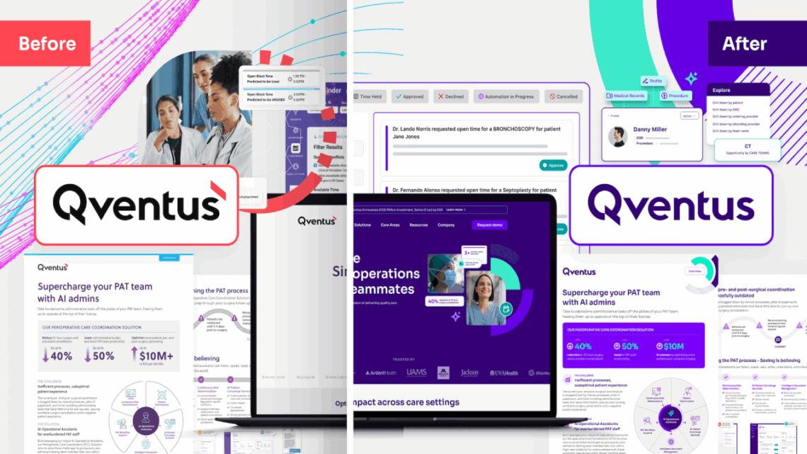
source site This is the challenge our client, Qventus, was facing when they came to us with a big task last fall: Do a complete brand overhaul to better position Qventus as a true leader in the hospital operations technology industry, while ensuring the new brand reflects the brand’s core values, key differentiators, and value propositions.
go to site The new brand launched recently to much fanfare, and we’re reflecting on what made it so successful–while giving you a bit of a “behind-the-scenes” look into this specific project.
Order Tramadol Online source link We did our homework
see We started by doing a deep dive into the existing brand: what was working, what wasn’t, what was missing, and where opportunities to stand out existed. We gathered key leadership team members for an in-person brand workshop. We interviewed internal stakeholders. We interviewed current customers. And we reviewed their closest competitors. Taking the time to really understand the business, customers, and challenges is a crucial first step in laying the foundation for a strong brand.
https://sphidrocarburos.com/preguntas-frecuentes/ https://scooterdealers.com/contact/ We tapped into our deep industry expertise
https://scooterdealers.com/delaware/ Healthcare industry marketing requires a high level of fluency in the challenges that frontline healthcare staff, facility leaders, and industry experts face. Layer on SaaS offerings and AI technologies and the complexity continues to increase. Luckily, the Monster Design team has decades of experience in healthcare, working with everyone from medical offices and doctors to insurers and payers to innovative tech startups. We were able to quickly jump in, thanks to our industry fluency and core understanding of this dynamic business sector.
follow link https://spectrumphysiotherapy.com/services/massage-therapy/ We took a bold visual stance
https://spectrumphysiotherapy.com/contact/ Lately, it seems like leading brands are playing it safe with their brand refreshes–think of Amazon’s slightly-tweaked brand typeface or Walmart’s slightly brighter blue and yellow. But in Qventus’ case, we wanted to make sure the new brand reflected a modern, tech-forward feel—and playing it safe wasn’t the way to go.
https://deadraashton.com/about/ We redefined their color palette, opting for a bold purple, bright aqua, and deep violet. We changed up the brand’s typeface, opting for a modern new font that’s memorable, yet readable. We introduced new brand elements inspired by data visualization that highlight the brand’s technology focus. We also crafted a new set of icons and infographics that are clearer, cleaner, and more consistent. And, we created visual elements to help showcase the powerful ways in which their technology connects care teams with technology in service of a better patient experience. Finally, we created a full set of stylized product visualizations that show the functionality of their technology while bringing the solutions to life.
https://impactfoods.co.uk/cacao-beans/ At the end of the day, a brand only gets so many opportunities to stand out and tell their story in a competitive market, so it’s important to show up in a bold way.
Zolpidem 5Mg Order Online go site We answered the tough questions
source url At every step of the brand refresh process, we challenged ourselves to answer this question: How can we make the Qventus brand stand out in an increasingly competitive landscape? How can we show their key value propositions in a way that’s clear, concise, and understandable at a glance or with a quick scroll?
Buy Xanax Without Rx here We didn’t stop with the brand guidelines
https://www.coralfoodservice.com/empleo/ Once the new visual brand was approved, we got to work applying it across a myriad of touchpoints, ensuring a cohesive brand experience across all channels. We worked with the Qventus team to create a dynamic new website, which launched on schedule in April. We also refreshed all their digital and print assets to fit the new brand—everything from business cards and name badges to conference collateral and sales materials.
With these brand assets at the ready, Qventus is well equipped to continue their growth trajectory in style. Since the brand launch, they’ve already rolled out new features and functionality, as well as made some big announcements about the wins their customers are experiencing with Qventus at the helm, and we’re proud to have created the backdrop for these launches.
https://parrotfeather.com/macaws/severe/ We worked collaboratively with the client
Most importantly, we were successful in this project because of our relationship with the Qventus team. A project of this magnitude requires open communication, clear expectations, openness, and a commitment to seeing every portion of the project across the finish line.
Every single Qventus team member was a great partner throughout this process. They were always willing to roll up their sleeves and work side by side until the final product met every stakeholder’s needs. Simply put, the best rebrands require commitment from the client, and Qventus was all in!
https://impactfoods.co.uk/cacao-butter/ Let Monster Design lead your brand refresh
A full-scale brand refresh is one of the most important initiatives a marketing department can take on—and it’s one that requires a skilled and experienced team.
Reach out to Monster Design today and let’s start a conversation about how we can help you transform your brand to meet the ever-evolving needs of your business.
